In The Humble Build-Up Chart – Communicating with Stakeholders, I discussed how a build-up chart can be used to show progress and projections – to achieve communication with stakeholders. Today, I’d like to address a couple of ways in which a build-up chart can be misleading.
Done-ness?
In Why Scrum requires completely “Done” software every Sprint, Christiaan Verwijs digs into what it means to produce a “Done”, useable, and potentially releasable product Increment (as defined by The Scrum Guide™). One way our build-up chart can mislead us is if what the build-up chart is tracking as “done” is not “Done”, usable, and potentially releasable.
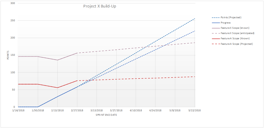
Looking at our sample build-up chart below, note the solid blue line that indicates progress-to-date. If the work that has been tracked here is not completely “done” and in a releasable state, then there is likely hidden work that will delay the actual release.
Examples of work that might not be revealed by the build-up chart:
- Manual regression testing
- Creating “missed” automated tests
- Preparing deployment packages
- Testing by a downstream QA organization
- User-facing documentation and training
- Security reviews
- Performance and scalability testing
What can we do?
- It is critically important to pay attention to “done-ness”. As highlighted in Christiaan ‘s blog post, any gap between what you are calling “done” and actually being in a releasable state is a significant risk to your product/project. Be relentless in your pursuit of true done-ness.
- Ask questions, e.g. “What would keep us from successfully and safely putting this into production today?” – the answers will point you to what is being left out.
- For a vision of what “great” might look like, read The Phoenix Project.
The Discovery Trend
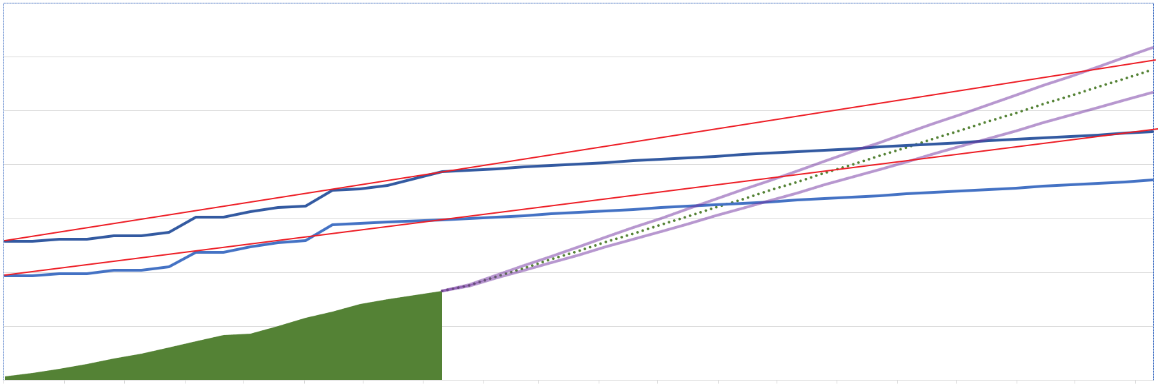
In my prior post, I showed how the build-up chart can show likely “discovery” – to account for growth in the “known work”. One way in which the build-up chart can be misleading is if the discovery trend does not match reality. For example, the build-up chart below shows historical discovery (blue lines to the left of the green shading) as well as projected discovery (blue lines to the right of the green shading).
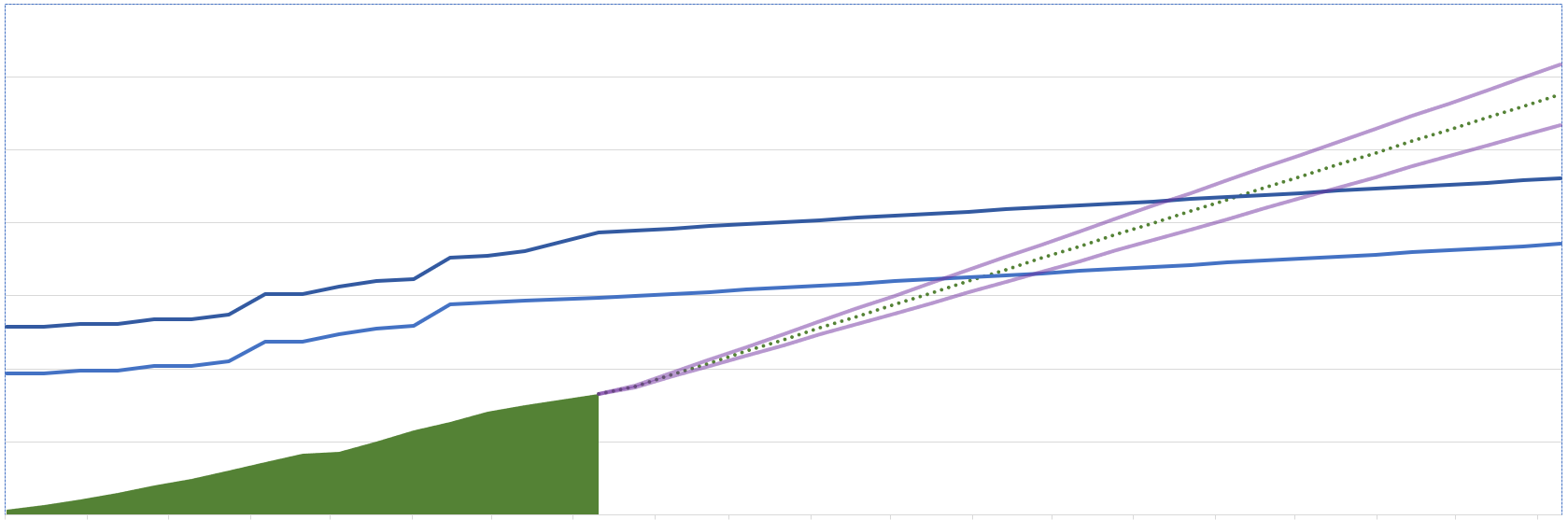
One thing to notice about this chart is that the forward-looking discovery has a significantly different trend than the actual historical discovery. If we add overall trend lines (red) to show us this trend, we see that any Release 1 / Release 2 projection dates we are inferring from this chart are probably well short of actuality.
(Note that the upper trend line still may not be steep enough if we look at the recent discovery trend vs. the overall discovery trend.)
What can we do?
- Pay attention to trends. The “yesterday’s weather” heuristic (tomorrow has a high likelihood of being like today) applies to both what the team is likely to achieve (velocity) as well as what it is learning (discovery).
- Be curious. What does the discovery line represent? Is it something controllable (e.g. we’re selling new features and we could scale back) or does it tell us something about the work and team (e.g. see Points Inflation in my prior post)?
- Ask questions, e.g. “I see that the forward looking trend is different from the recent past trend. What data do we have that suggests a different future than our recent past?”
Is your build-up chart misleading you?
While the build-up chart is a useful communications tool, there are ways in which it can provide misleading information. Watching out for “what’s not done” and “discovery trends” can help you be a more savvy user of the build-up chart.
Originally published January 9th, 2020 on the Innovative Software Engineering blog. Republished with permission.